GreatFit Clothing Store
Greatfit is an online e-commerce store that sells ladies clothing. They make a lot of sales through various platforms. Customers generally leave reviews and in this project, I aimed to develop a dashboard to give an idea of how the reviews are by answering the following questions:
Do they get a lot of negative/positive reviews?
Analysis on the reviews by division
Do people recommend their products?
Do reviews mention anything about returning items?
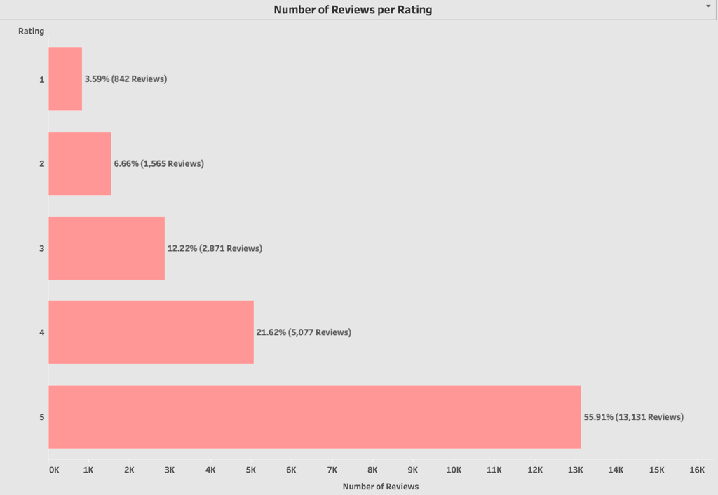
To answer the first question, I designed a Bar Chart to provide the number of reviews per rating
Given the Dataset:
Ratings of 1 & 2 can be considered as negative since they are below the mid-point of the scale.
A rating of 3 is generally considered neutral.
Ratings of 4 & 5 are positive since they are above the mid-point of the scale.
From the chart:
Most of the reviews are positive, with 18,208 reviews (sum of 4-star and 5-star ratings) indicating satisfaction or great appreciation for the product/service. Neutral reviews, represented by the 3-star rating, total 2,871 reviews, showing a moderate amount of ambivalence.Negative reviews, which are the combined total of 1-star and 2-star ratings, are the lowest in number at 2,407 reviews.
The product or service is generally well-received, as indicated by the overwhelmingly high number of positive reviews. The number of neutral reviews suggests that there's a segment of the audience that felt the offering was neither particularly good nor bad. The number of negative reviews is relatively small compared to positive reviews, but it still represents a notable number of customers who had unsatisfactory experiences.
This feedback is valuable as it can help businesses understand their strengths
To answer the second question, I created a Stacked Bar Chart to show the ratings by division.
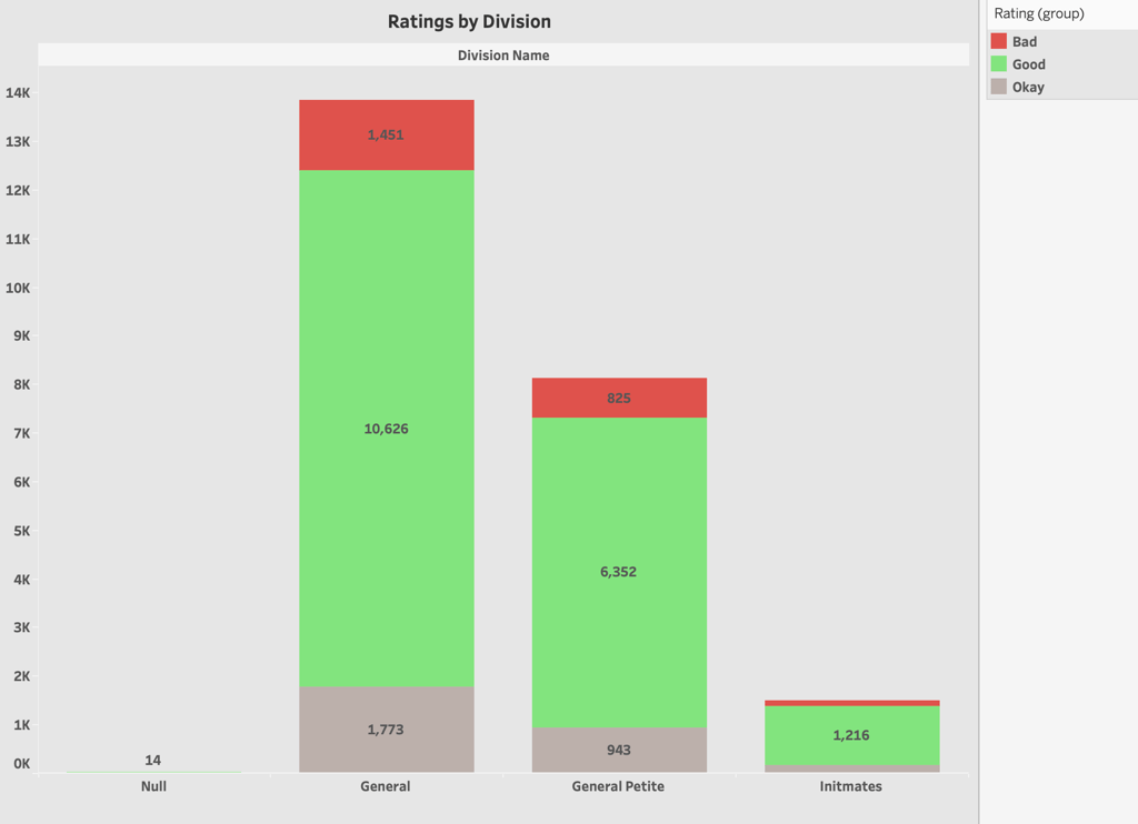
Volume of Reviews:
The General Division has the highest total number of reviews, followed by the General Petite Division, with Intimates having the least.
Proportions & Trends:
For all divisions, the number of good reviews (green) dominates. This indicates a generally positive reception across all divisions.
The General Division has a significant number of neutral (OK) and negative (Bad) reviews, but these are dwarfed by the large number of positive reviews.
In General Petite, the trend is similar to the General Division, but with a slightly higher proportion of negative reviews relative to the total.
Intimates sees the least number of negative reviews in proportion to its total reviews, suggesting higher satisfaction or perhaps less polarization in customer opinions for this division.
Potential Areas of Focus:
While the sheer number of positive reviews for the General Division is commendable, the combined total of OK and Bad reviews (3,224) can't be ignored. Addressing the concerns of this sizable segment could lead to improved overall satisfaction.
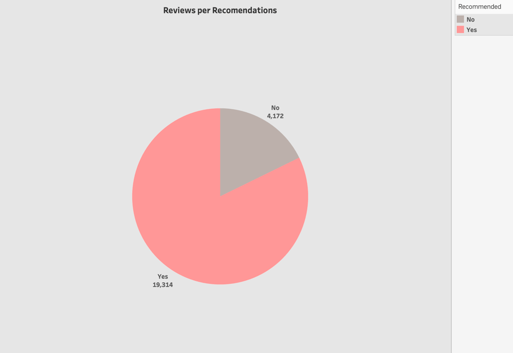
To answer the third question, I created a Pie chart to show the reviews per recommendations.
Overall Proportions:
A significant majority of the reviews, accounting for approximately 82.2% (19,314 out of a total of 23,486 reviews), have given a "YES" recommendation. This is a clear indication that most of the reviewers are satisfied with the product or service to the extent that they would recommend it to others.
The remaining 17.8% (4,172 reviews) have given a "NO" recommendation. While this is a smaller proportion, it's still a considerable number of reviewers who wouldn't endorse the product or service.
Implication for Business:
The large proportion of "YES" recommendations is a strong positive sign, suggesting the business is delivering value that resonates with a vast majority of its customer base. However, the "NO" segment, even if smaller, can't be overlooked. It represents potential areas of improvement. Businesses should delve deeper into these reviews to understand the reasons for dissatisfaction and address those areas.
While pie charts provide an immediate visual grasp of data proportions, they can occasionally oversimplify the nuances within the data. In this chart, the prevalence of positive recommendations is evident. However, to truly understand the underlying reasons for both recommendations, a deeper dive is essential. Detailed reviews have been made available and incorporated into the final dashboard. For a comprehensive understanding of each recommendation, a “Click for Detail” link has been provided alongside both recommendations when clicked.
To answer the last question, I created a bar chart to show the number of reviews of mentions returned items

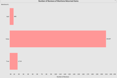
Null: 845 reviews
False: 20,927 reviews
True: 1,714 reviews
Analysis:
Overall Interpretation:
True: This bar represents reviews that mention returned items, indicating dissatisfaction or issues with the product that led customers to return it.
False: This bar indicates reviews that did not mention any returned items. These reviews are presumably from customers who kept the product.
Null: This bar represents reviews where it's unclear or not specified whether the item was returned or not.
Proportions & Trends:
A vast majority of the reviews (20,927 out of 23,486 or approximately 89.1%) did not mention returning the product. This suggests a high level of satisfaction or at least a decision not to return the product after purchase.
Reviews that specifically mentioned returning the product (1,714) constitute about 7.3% of the total reviews. This is a significant number and indicates areas that the business may need to address, whether it's product quality, product description accuracy, or some other aspect that's leading to returns.
Reviews with a Null value (845 or roughly 3.6% of total reviews) present an area where it's uncertain if returns were involved. It's possible these reviews discuss aspects unrelated to product satisfaction or the purchasing decision.
Business Implications:
True bar (Returns): It's crucial to dive deeper into these reviews to understand the common reasons for returns. This could provide insights into product improvements, better descriptions, or addressing post-purchase concerns.
False bar (No Returns): While this is the largest segment, and it indicates a good sign that most customers didn't feel the need to mention returning their purchase, it's still worth analyzing the content of these reviews to gauge overall satisfaction.
Null bar: It might be useful to explore if there's a pattern in these reviews that could be informative for the business.
Conclusion:
The horizontal bar chart suggests that a significant majority of customers did not mention returning their purchases in their reviews. However, the business should pay special attention to the 1,714 reviews that did mention returns to understand and address any underlying issues. The "Null" category can be further analyzed to ascertain if there are any implicit insights that can be gleaned.
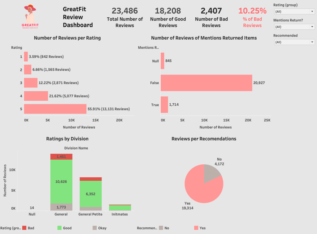
Lastly, I've combined all the charts into one dashboard. It can be accessed by clicking on the image below.