Exploratory Data Analysis and Visualization in PYTHON
In this project, I used a dataset from a supermarket chain store. The dataset provides information, capturing various aspects of the business. I've conducted an analysis and explored the correlation between variables. The goal of this project was to uncover insights that could help the supermarket chain enhance its operations.
import pandas as pd
import numpy as np
import matplotlib.pyplot as plt
import seaborn as sns
import calmap
from pandas_profiling import ProfileReport
file_path = "C:/Users/chris/OneDrive/Desktop/supermarket_sales.csv"
df = pd.read_csv(file_path)
#DATA EXPLORATION
num_rows = len(df)
print("Number of rows:", num_rows)
Number of rows: 1000
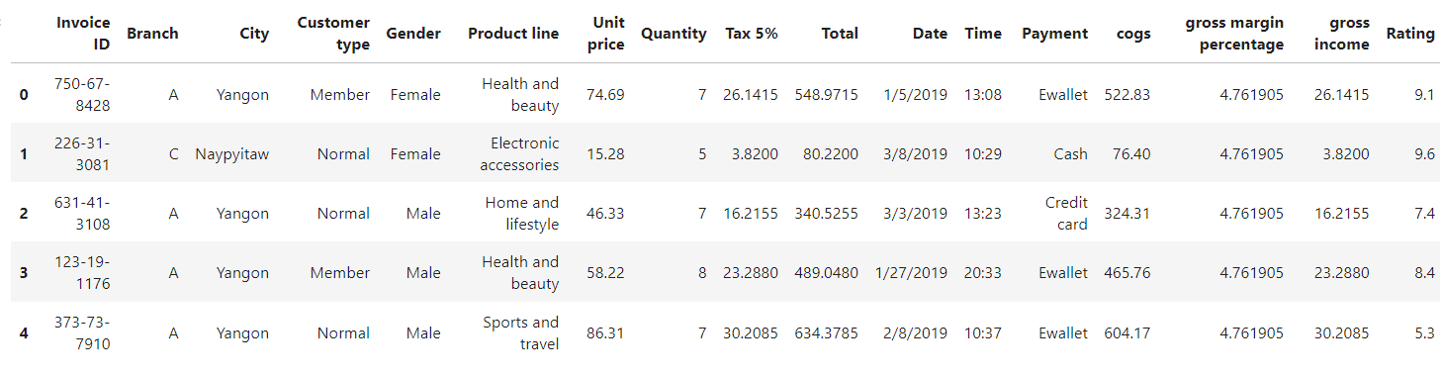
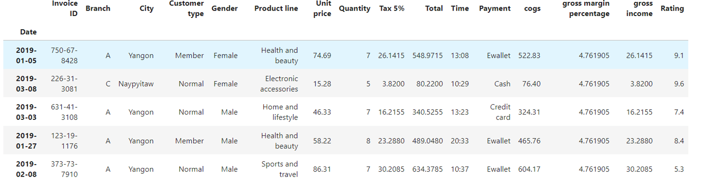
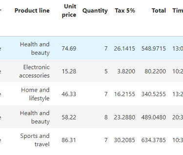
#Top 5 rows
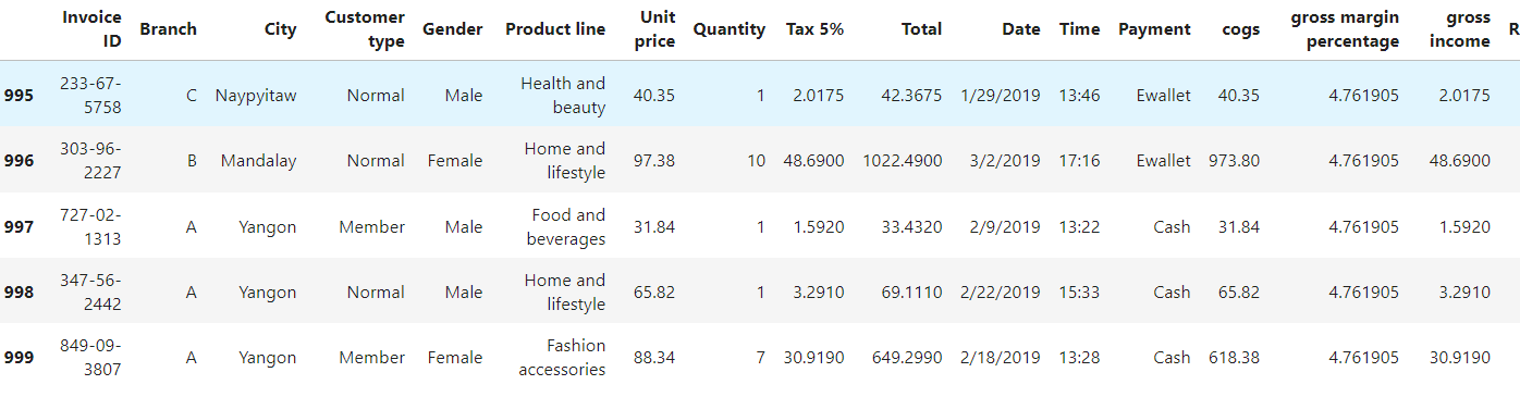
df.head()
#Last 5 rows
df.tail()
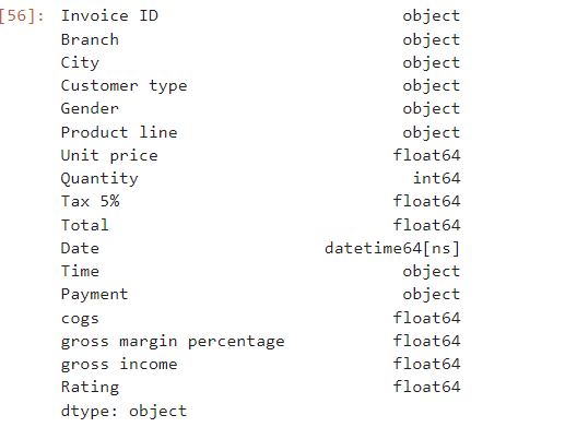
df.columns
Index(['Invoice ID', 'Branch', 'City', 'Customer type', 'Gender', 'Product line', 'Unit price', 'Quantity', 'Tax 5%', 'Total', 'Date', 'Time', 'Payment', 'cogs', 'gross margin percentage', 'gross income', 'Rating'], dtype='object')
df.dtypes
#Convert the values in the 'date' column to datetime format and set it as the index of the dataframe
df['Date'] = pd.to_datetime(df['Date'])
df.set_index('Date',inplace=True)
#Top 5 rows again
df.head()
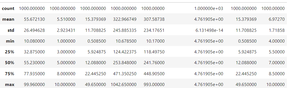
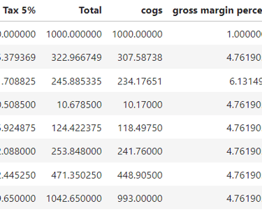
df.describe() #Numerical columns
#UNIVARIATE ANALYSIS
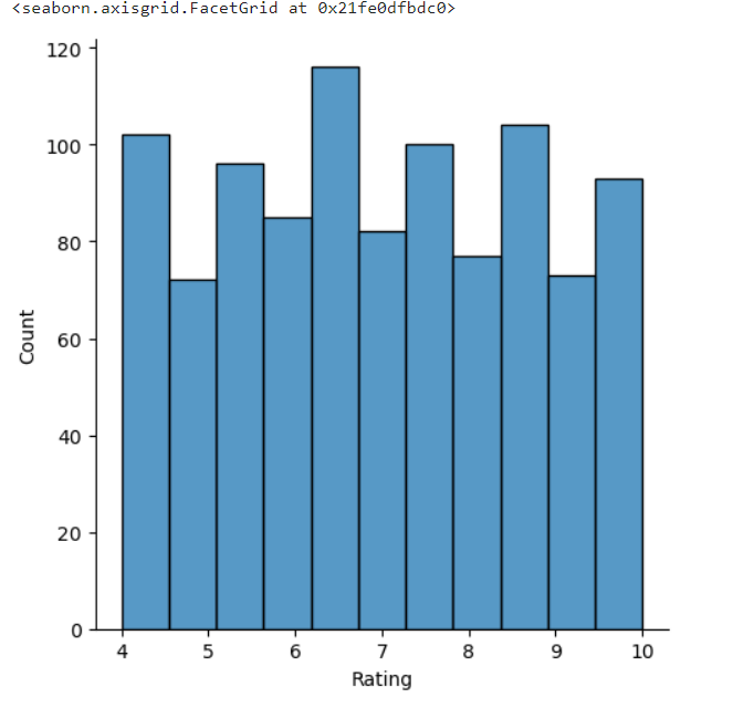
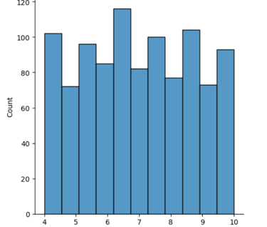
#Distribution of customer ratings
sns.displot(df['Rating'])
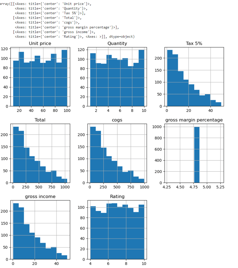
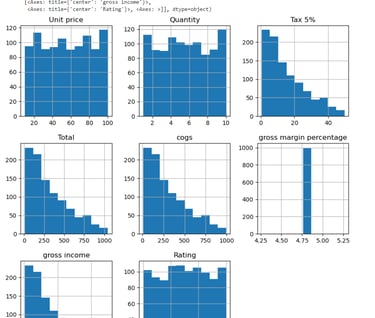
#Univariate analysis for all columns:
df.hist(figsize =(10,10))
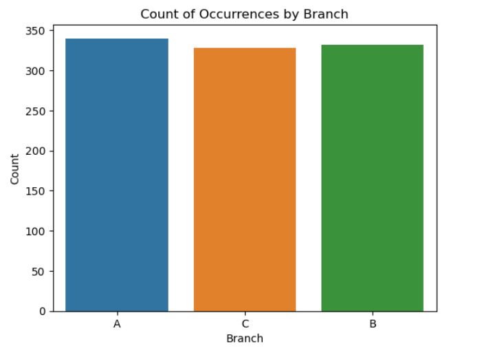
#Count of occurrences by branches
sns.countplot(data=df, x='Branch')
plt.xlabel('Branch')
plt.ylabel('Count')
plt.title('Count of Occurrences by Branch')
plt.show()
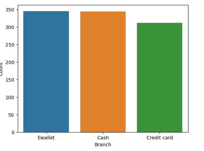
#Count of occurrences by payment
df['Branch'].value_counts()
A 340
B 332
C 328
Name: Branch, dtype: int64
sns.countplot(data=df, x='Payment')
plt.xlabel('Branch')
plt.ylabel('Count')
plt.show()
#BIVARIATE ANALYSIS
#Relationship between Gross Income and Customer Rating:
sns.regplot(x='Rating', y='gross income', data=df, line_kws={'color': 'red'})
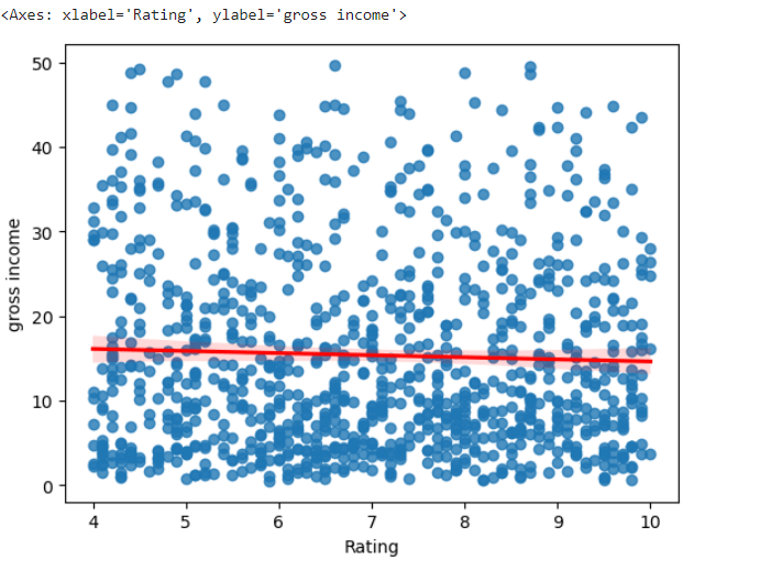
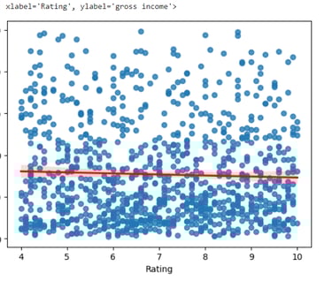
#Based on the scatterplot above, there is no relationship between rating and gross income
#Between Branch and Gross Income:
sns.boxplot(x='Branch', y='gross income', data=df)
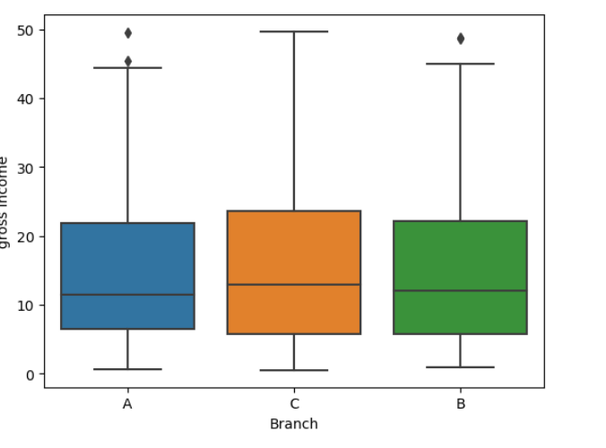
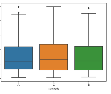
#Based on the boxplot, there no relationship between those two variables
#Between Gender and Gross Income:
sns.boxplot(x='Gender', y='gross income', data=df)
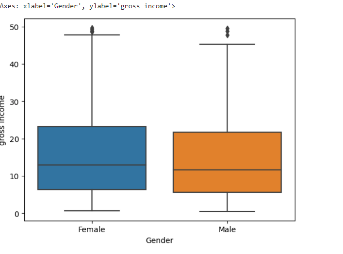
#Based on the boxplot on average both spend almost the same
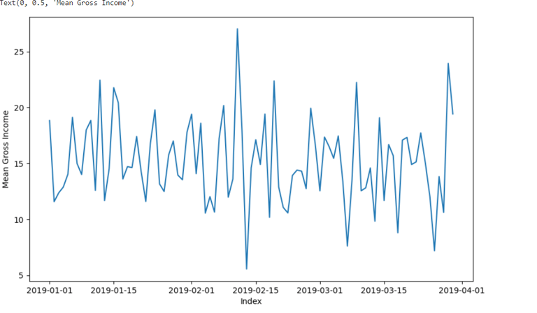
#Time Trend in Gross Income
#To check for trends, the data must be aggregated by using the GROUPBY function based on the index, and the .mean() method calculates the mean value for each group.
grouped_df=df.groupby(df.index).mean()
plt.figure(figsize=(10, 6)) # Set the figure size
sns.lineplot(x=grouped_df.index, y=grouped_df['gross income'])
plt.xlabel('Index')
plt.ylabel('Mean Gross Income')
#CHECK FOR DUPLICATES
df.duplicated()
0 False
1 False
2 False
3 False
4 False
...
995 False
996 False
997 False
998 False
999 False
Length: 1000, dtype: bool
#Each value in the Boolean Series is False, indicating that none of the rows in the DataFrame are marked as duplicates.
#To verify that there are not duplicates in the dataset, lets run the following code:
df.duplicated().sum()
0 #No duplicated values
#CHECK FOR MISSING VALUES
df.isna().sum()
#Plot to verify that there are no missing values.
sns.heatmap(df.isnull(),cbar=False)
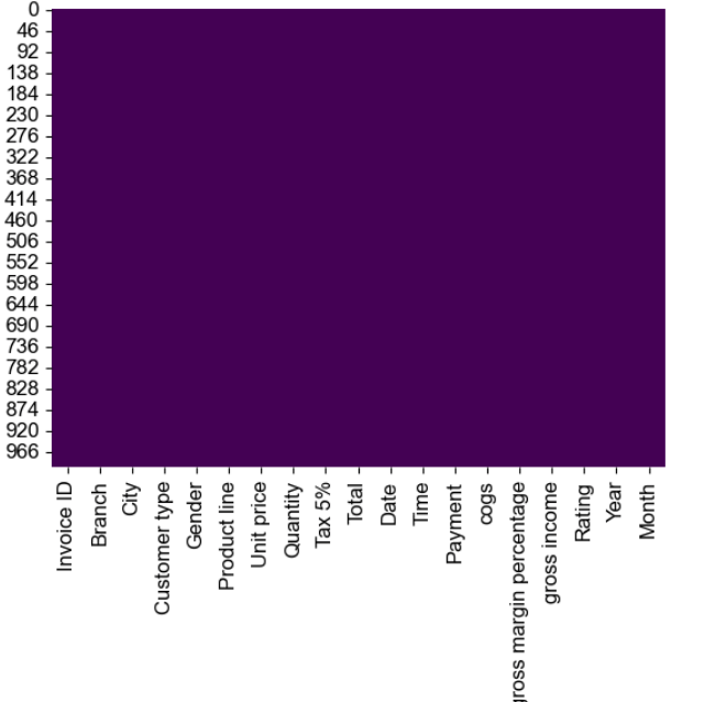
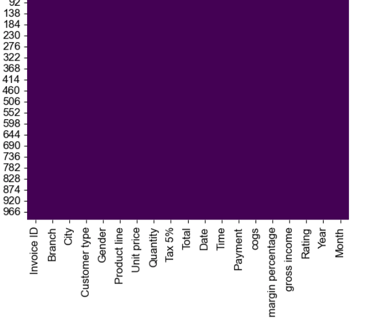
#The plot does not show any white lines in the box, indicating that there are no missing values in the dataset.
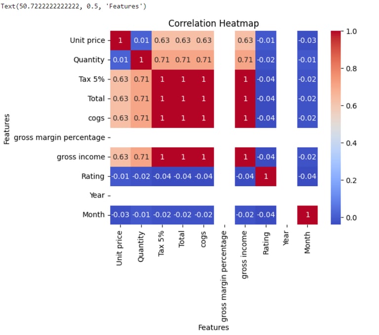
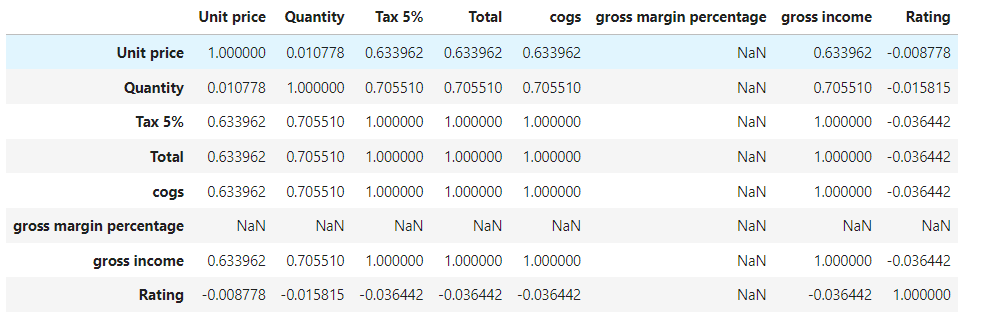
#CORRELATION ANALYSIS
df.corr()
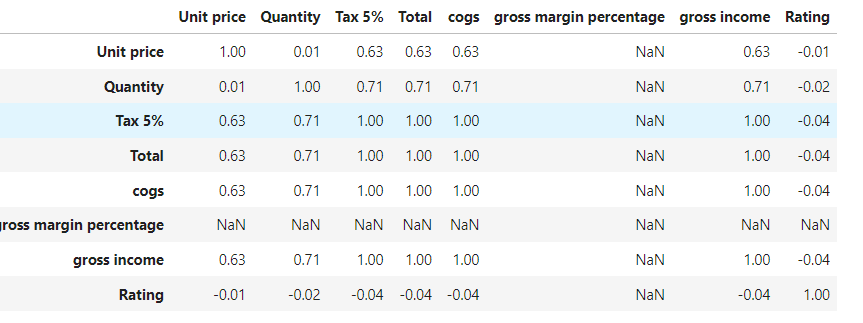
#Round the correlation to 2 decimals:
np.round(df.corr(),2)
#Plot the correlation:
sns.heatmap(np.round(df.corr(),2), annot=True, cmap='coolwarm')
plt.title('Correlation Heatmap')
plt.xlabel('Features')
plt.ylabel('Features')