
Visualization and Analysis (Step 3)
Once the final dataset was transported to a designated target system, it was leveraged for visualization and analysis using Tableau. Tableau provided a powerful platform for exploring the data, creating interactive visualizations, and conducting in-depth analysis. To enhance accessibility and facilitate further exploration, a link to Tableau Public is provided at the end of the page. This allows for an interactive experience with the visualizations and offers the opportunity for additional analysis and exploration of the dataset.
One of the primary requirements in terms of charts or visuals from the stakeholder requirement document was to have a table or map visualization that explores the starting and ending station locations, aggregated by location. This visualization provides a comprehensive view of the distribution and patterns of bike trips across different locations.
The map visualization displays the starting and ending station locations, along with relevant details such as user types, and. boroughs.
In the following chart, I continued exploring the starting and ending station locations, but this time, the focus shifted to neighborhood locations. The chart is aggregated based on the neighborhoods, allowing for a deeper analysis of bike trip patterns within specific areas.
To provide more detailed insights, the chart incorporates filters for both month and user type. This allows stakeholders to examine bike trip trends and behaviors within different time periods and user categories.
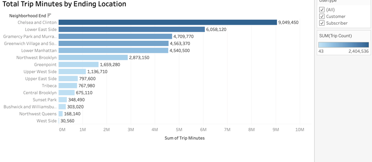
The next visualization I created is a horizontal bar chart that illustrates the popularity of destination (ending) locations based on the total trip minutes. This visualization focuses on aggregating the data by neighborhood location and applies a filter based on user type.
The bar chart provides a clear representation of the destination locations that attract the highest total trip minutes. Each bar represents a neighborhood location, and the height of the bar corresponds to the total trip minutes for that particular destination.
By applying the user type filter, stakeholders can gain insights into the trip patterns and preferences of different user segments. This filter allows for a comparison of total trip minutes among user types. It helps identify any variations in popular destination locations based on user behavior.
With this visualization, stakeholders can easily identify the most popular destination neighborhoods based on total trip minutes and understand how user types contribute to these trends. This information can inform decision-making related to station placement, marketing campaigns, or service improvements to further enhance the user experience.
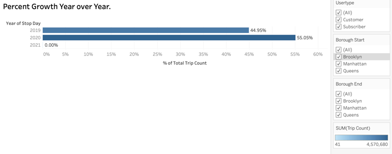
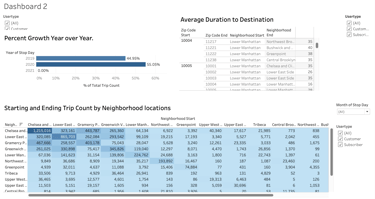
The next visualization I created is a horizontal bar chart that illustrates the percentage growth in the number of trips year over year. The data is aggregated based on the year over year comparison and includes filters for user type, starting borough, and ending borough.
Each bar represents a specific year, and its length corresponds to the percentage growth in the number of trips compared to the previous year. The horizontal orientation of the bars allows for easy comparison and identification of the years with the highest growth rates.
By applying filters for user type, starting borough, and ending borough, stakeholders can analyze the growth patterns within specific segments and geographic areas. This information helps identify any significant variations in trip growth based on user types and specific borough combinations.
The visualization enables stakeholders to understand the trends in trip growth over time, providing insights into the user behavior and preferences within different user segments and boroughs. This information can be valuable for strategic planning, identifying target areas for marketing campaigns, and making informed decisions to meet the growing demand for bike trips.
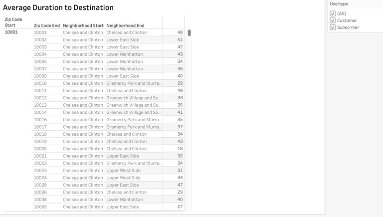
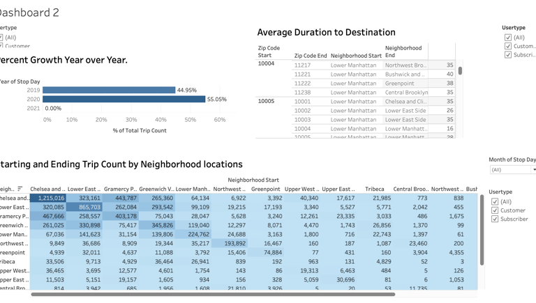
In the next visualization, I created a table that presents the average duration to destinations, aggregated by zip codes, neighborhood start, and neighborhood end. The table includes a filter for user type, allowing for analysis of congestion at stations based on different user segments.
By aggregating the data at the zip code, neighborhood start, and neighborhood end levels, the table provides a detailed view of average trip durations to specific destinations. This information helps identify potential congestion points or areas where bike trips may experience longer durations.
The user type filter enables stakeholders to assess congestion patterns for different user segments. By analyzing average trip durations for regular users or subscriber riders, it becomes possible to identify if certain user types contribute more to congestion or experience longer trip durations.
With this table, stakeholders can quickly scan through the data, pinpoint areas with higher average durations, and assess the impact of congestion on the overall user experience. This information can guide decision-making, such as station management strategies, improving infrastructure, or implementing measures to alleviate congestion and enhance the efficiency of bike trips.
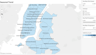
The next chart, is a map that provides insights about peak usage by time of day and season. The data is aggregated by zip code, neighborhood start, and neighborhood end, along with trip count and day total precipitation. The chart includes filters for day mean wind speed, user type, and day mean temperature.
The map visualization allows stakeholders to explore the peak usage patterns across different geographic areas. By selecting specific time intervals and seasons, users can observe the variations in trip counts and identify areas with high usage during specific times or seasons.
The chart also incorporates additional data elements such as day total precipitation, day mean wind speed, and day mean temperature. By applying filters to these variables, stakeholders can examine how weather conditions and user types contribute to peak usage trends.
This interactive map provides a holistic view of peak usage patterns, taking into account geographic locations, time of day, seasons, weather conditions, and user segments. It enables stakeholders to identify areas of high demand, understand the impact of weather on usage patterns, and make data-driven decisions related to resource allocation, marketing strategies, and operational planning.
After creating the individual charts, I organized them into two separate dashboards for enhanced data exploration and analysis.
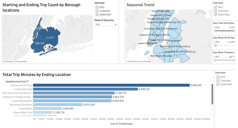
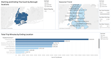
The first chart combines starting and ending trip counts by borough locations, seasonal trends, and total minutes by ending location. This comprehensive chart provides stakeholders with a multi-faceted view of the bike trip data.
The chart includes a breakdown of trip counts based on the borough locations where the trips originate and end. This allows stakeholders to identify which boroughs have the highest volume of bike trips, providing insights into popular starting and ending points.
Additionally, the chart showcases seasonal trends in trip counts, enabling stakeholders to observe any fluctuations or patterns in bike usage throughout the year. This information can help with season-specific planning, such as adjusting bike availability or marketing efforts.
Furthermore, the chart displays the total minutes by ending location, giving insights into the duration of bike trips and potential variations across different destinations. This information can aid in identifying areas where longer or shorter trips are more prevalent, offering insights into usage patterns and potential areas for improvement
The second dashboard combines the following charts: percent growth year over year, average duration to destination, and starting and ending trip count by neighborhood location. This comprehensive dashboard provides stakeholders with a comprehensive overview of key metrics related to bike trips.
The percent growth year over year chart illustrates the percentage change in trip counts compared to the previous year. This helps stakeholders identify periods of significant growth or decline in bike usage, allowing for informed decision-making and strategic planning.
The average duration to destination chart provides insights into the average time it takes to reach different destinations, aggregated by neighborhood location. This information helps stakeholders understand variations in trip durations across different areas, supporting operational planning and resource allocation.
The starting and ending trip count by neighborhood location chart showcases the volume of trips originating and ending in specific neighborhoods. This enables stakeholders to identify areas of high demand and potentially allocate resources accordingly, such as adjusting bike availability or station placement.
The link below will open Tableau Public, where you can fully access and analyze both dashboards. This interactive platform allows you to explore the visualizations, interact with the data, and gain valuable insights.